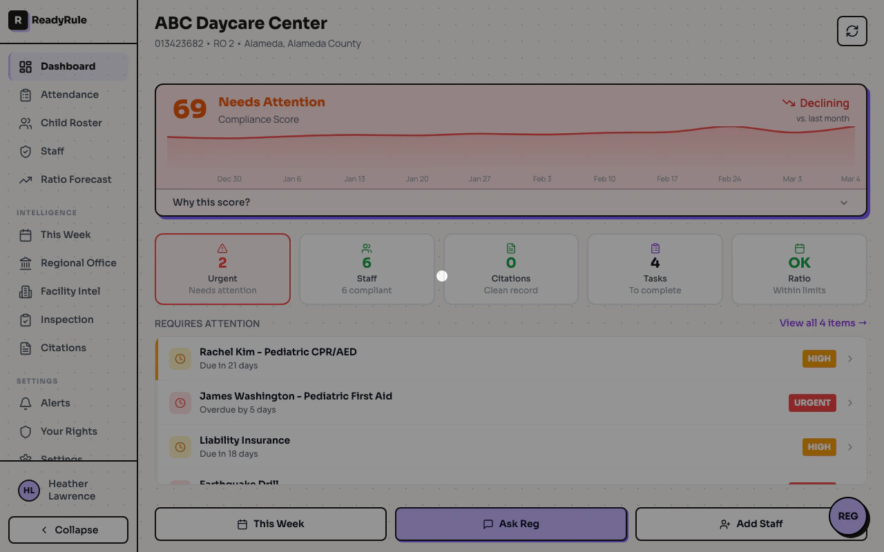
The 12-Week Trend Chart shows your facility’s compliance score history as a line chart. Instead of just seeing today’s score, you can spot patterns over time — whether compliance is improving, declining, or staying steady.Documentation Index
Fetch the complete documentation index at: https://readyrule.com/docs/llms.txt
Use this file to discover all available pages before exploring further.
Quick start: view your trend
Find the trend chart
On desktop or tablet, the 12-Week Trend chart appears below the compliance score bar.
Understanding the chart
Chart elements
- Y-axis (vertical): Compliance score percentage (0-100)
- X-axis (horizontal): Dates over the past 12 weeks
- Line: Your score trend over time
- Points (dots): Weekly snapshot of your score
Interpreting the trend
| Pattern | What it means | Action |
|---|---|---|
| Upward slope | Compliance is improving | Keep doing what you are doing |
| Downward slope | Compliance is declining | Review expired items and upcoming renewals |
| Flat line | Stable compliance | Maintain current practices |
| Sharp drop | Sudden issue | Check for expired certifications or missed items |
| Sharp rise | Quick improvement | You fixed something significant |
Score color coding
| Score range | Color | Status |
|---|---|---|
| 90-100% | Green | Excellent — in great shape |
| 70-89% | Yellow/Orange | Needs attention — address expiring items |
| Below 70% | Red | Critical — take action now |
When the chart appears
The chart appears on desktop and tablet dashboards (viewports 1024px+ wide) after you have at least 2 weeks of compliance data. Until then, you will see a placeholder message: “Historical trend will appear here once we have at least 2 weeks of data.” A snapshot is taken automatically each week when you view your dashboard. No manual action is required — just use ReadyRule normally.Using the chart for compliance management
Weekly check-in
Make it a habit to glance at your trend each week:- Look at the direction — Is it going up, down, or staying level?
- Note any sudden changes — A sharp drop means something changed
- Anticipate problems — A slow decline often means certifications are expiring
Identifying issues early
| Trend pattern | Likely cause | How to investigate |
|---|---|---|
| Gradual decline | Certifications expiring | Check staff certification dates |
| Sudden drop | Item just expired | Look at “Items Needing Attention” section |
| Plateau below 90% | Missing requirements | Review compliance checklist for incomplete items |
Troubleshooting
How often is my score recorded?
How often is my score recorded?
Your score is recorded automatically once per week, the first time you view your dashboard. You don’t need to do anything special.
Why do I only see a few data points?
Why do I only see a few data points?
You accumulate more data points over time. The chart shows up to 12 weeks of history. New facilities or recent signups will have fewer points initially.
Can I see older history?
Can I see older history?
Currently, the chart shows the past 12 weeks. Older data is stored but not displayed to keep the chart readable.
Why did my score change between snapshots?
Why did my score change between snapshots?
Scores change when staff certifications expire or are renewed, required items are marked complete or incomplete, facility requirements change, or training is completed or expires.
The chart is empty or shows an error
The chart is empty or shows an error
If you see “Loading…” that won’t go away, refresh the page and check your internet connection. If you see “Error loading trend data,” wait a moment and refresh — this is usually a temporary connection issue.
Tips
- Check weekly: A quick glance at the trend takes seconds and catches problems early.
- Watch for downward trends: A declining score often means certifications are about to expire — address them before they become overdue.
- Use the hover feature: When you see a dip, hover to see the exact date, then think about what changed around that time.
- Set a reminder: Check your dashboard every Monday morning to start the week with visibility into your compliance status.
- Share with your team: If the trend is improving, celebrate. If it is declining, use it to start a conversation about what needs attention.